This post is dedicated to showing the transformation of our own personal home that we bought last spring. This process was the opposite of staging. The purpose of staging a home for resale is to make it as impersonal as possible, and ensure that it appeals to a wide range of people. Everything following is my own personal taste, and it is very specific to me. The difference between staging and decorating is real and distinct, and this post is an illustration of that.
Lessons learned:
- I LOVE shopping for beautiful furniture, decor and fixtures. It’s fun!
- The possibilities of combinations of furniture, decor, and fixtures is literally endless, which leads me to lesson number three…….
- Paradox of Choice- A psychological theory by American psychologist Barry Schwartz claiming that, after a certain threshold is reached, an increase in the number of choices will cause a significant amount of psychological distress. This distress, according to Professor Schwartz, can manifest itself in many ways. One way is through buyer’s remorse. The theory states that buyer’s remorse is created through increasing opportunity costs associated with increased choices. Opportunity costs associated with alternate choices compound and create strong feelings of dissonance and remorse. As the number of choices increase, it is easier to imagine a different choice that may have been better than the one selected. The constant comparison to one’s expectations induces regret, which reduces the satisfaction of any decision, even if it fills the individual’s needs. When there are many alternatives to consider, it is easy to imagine the attractive features of rejected choices and there is a decrease in overall satisfaction. source: wikipedia
This means that because of all the choices available to me, I second guessed myself and drove myself crazy and into distress too often. I made many returns and discovered that many times I just had to buy something, bring it home and see how it worked in the space. Failing forward.
4. I am discovering that home design is a continual work in progress. It’s never “done”. You can always find different lamps, a better sofa, a trendy fixture. The key is to relax about it all, trust yourself, and enjoy the process as much as possible. It’s not rocket science; it’s design.
5. Start with a color palette in mind. They say to look in your closet for the colors of the clothes you wear the most. I actually started with movies for inspiration: the Indiana Jones trilogy and Lord of the Rings. I discovered that I am an Art Deco girl. Indiana Jones has that 1920’s-1940’s world traveler/academic thing down which I just love. It makes me feel sophisticated, snuggly, and exotic all at the same time. It’s cozy and comforting; as is Bilbo’s hobbit hole. Once I started with those adjectives and looked up pictures online, I got a clearer picture of where I wanted my living room to go.
6. Measure your space! Look up online sample floor plans that mimic the space you have to work with. Identify your focal points. I am fortunate to have a fireplace, and that is my focal point. I centered everything around it. Before I made any major irrevocable furniture purchases I made sure to know how long my sofas could be to still leave adequate walkway space through the room.


Before and After. The shrubs and trees were not only overgrown, but the tree roots were growing dangerously close to the foundation. We removed everything and started from scratch. The rows of boxwoods in front will create a low Alice in Wonderland hedge with a few more years of growth, and in the spring, the rows of big beautiful hydrangeas will bloom tall behind them, spilling over the tops. The centerpiece exotic Japanese maple will continue grow in size next to the climbing rose covered trellis.

 This was the kitchen before. I hated that fridge in that spot, visually making the kitchen look smaller. Also, only a tiny closet pantry for food was next to the fridge and the shelving was so narrow cereal boxes almost didn’t even fit. It just wasn’t functional. None of the appliances worked and the floor was coming up in places where there had been water damage.
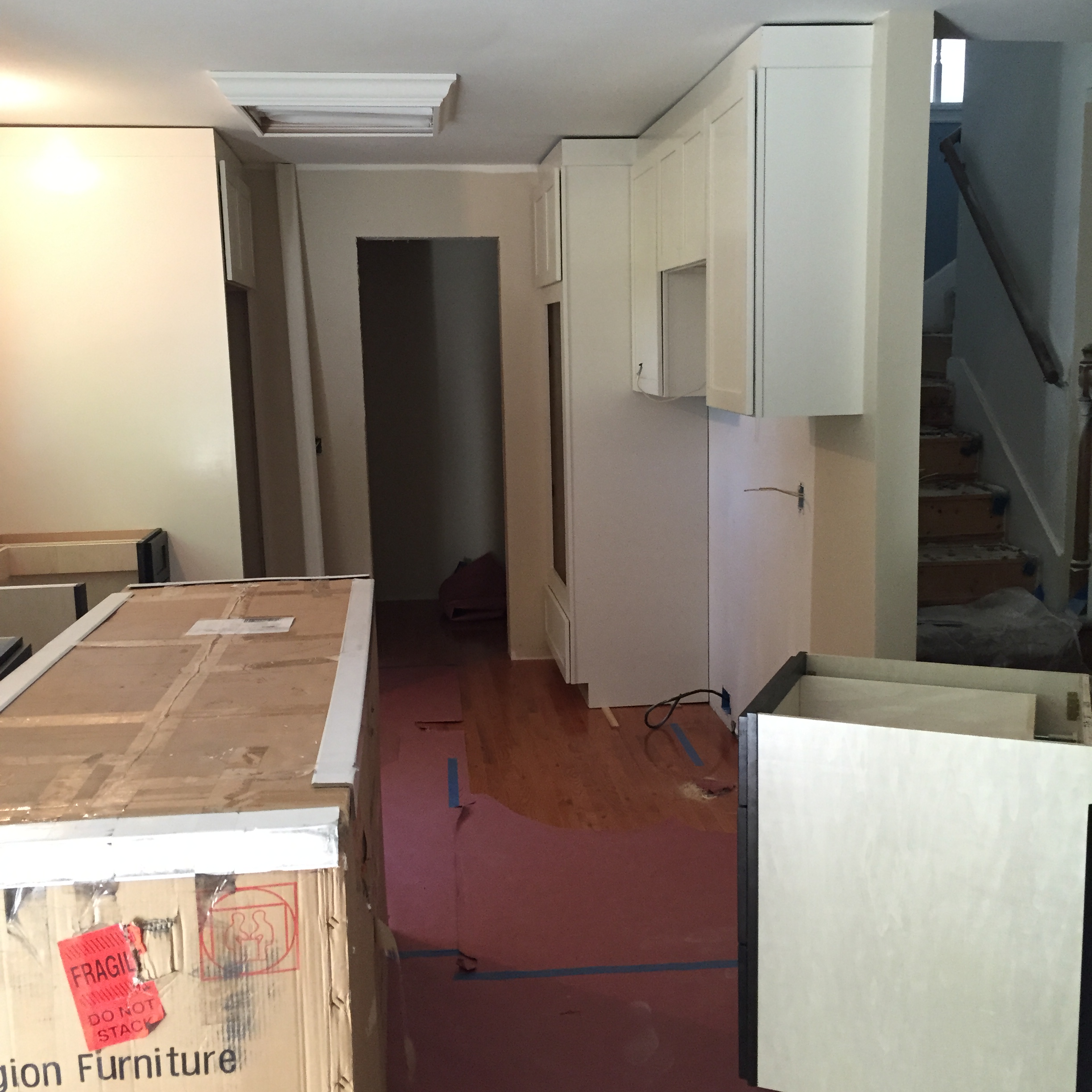 In progress here. We took everything down to the studs and reworked the floor plan. We utilized space behind the back wall to create a walk in pantry, which I LOVE!, and moved the positioning and cabinetry for the fridge and double ovens to the back walls beside the pantry so the kitchen seems more open and unobstructed. I have plenty of room for my burgeoning Costco addiction now.
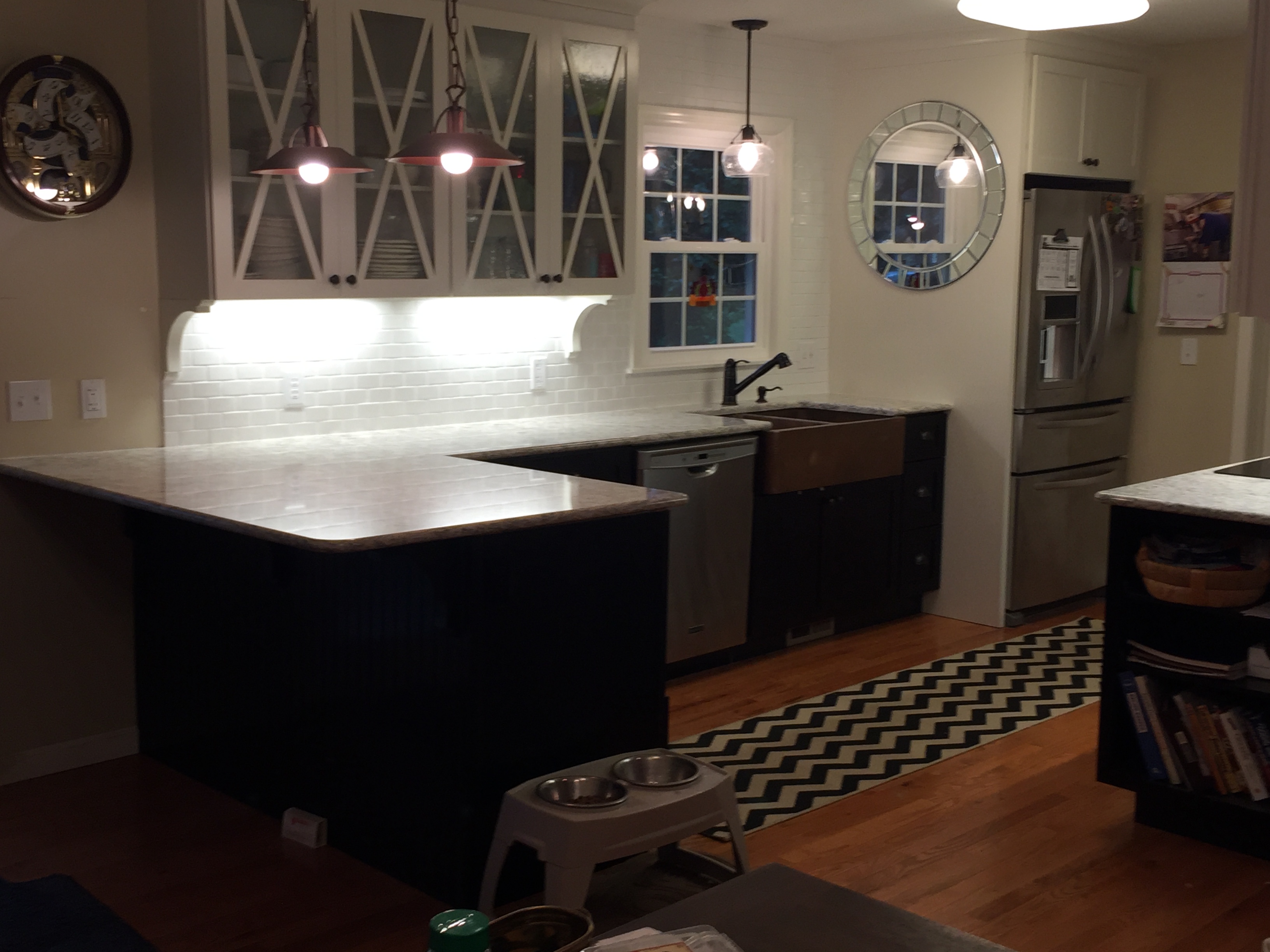

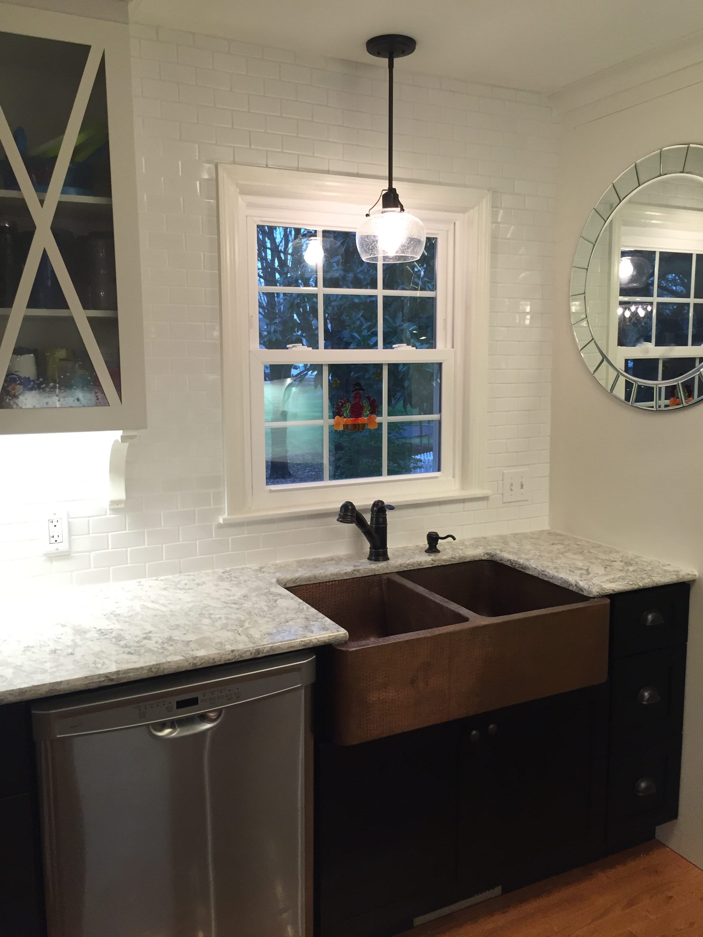 I designed the glass kitchen cabinets with the “X” design on the doors. I chose seeded glass which repeated itself in the light fixture hanging over the sink. I chose a big beautiful copper farm house kitchen sink because I love the warmth of the copper, and I think it ties in with the color of the wood floors. HOWEVER, I would not pick it again; copper is finicky and with use over time it gets a patina which isn’t my cup of tea. I originally wanted to go with a white porcelain farm sink, but I was afraid of getting dings and chips in it with the constant heavy use that the sink sees in my household. With two young children, things in my house tend to take a beating.
Speaking of durability, I chose Cambria Quartz countertops in the Berwyn pattern because there is almost no countertop on the market that is more durable, beautiful, and that needs zero maintenance. Granite needs sealing and special cleaners to look and perform at it’s best, and while marble is beautiful, it is SO not practical for a kitchen that will actually be used. This gave me the appearance of marble, but with SPARKLES, and peace of mind knowing it will always look brand new. It is much more expensive than granite, but for my situation, we were able to do it and I’m glad we did.
I added an induction cooktop, which is so cool I can’t stand it, and copper pendants over the peninsula which tie in the with sink. Under cabinet LED lighting highlights the sparkles in the countertops and adds an incredible amount of light to help me see while cooking. I positioned a mirror next to the window so that it will reflect and amplify the natural light coming into the kitchen, making everything look brighter. Even better that it was a $20 yard sale find! The backsplash I kept as a neutral white subway tile because it is classic and lets the countertops really shine and take the spotlight. I didn’t want my backsplash to compete with the most standout part of the remodeled kitchen.
Also, if you noticed, my upper cabinets are white, and my lower cabinets are black. This two tone color approach on cabinets is on trend and allows for a more custom, furniture type look. Copper hardware ties in with the other copper elements in the room. Stainless appliances round out the equation.
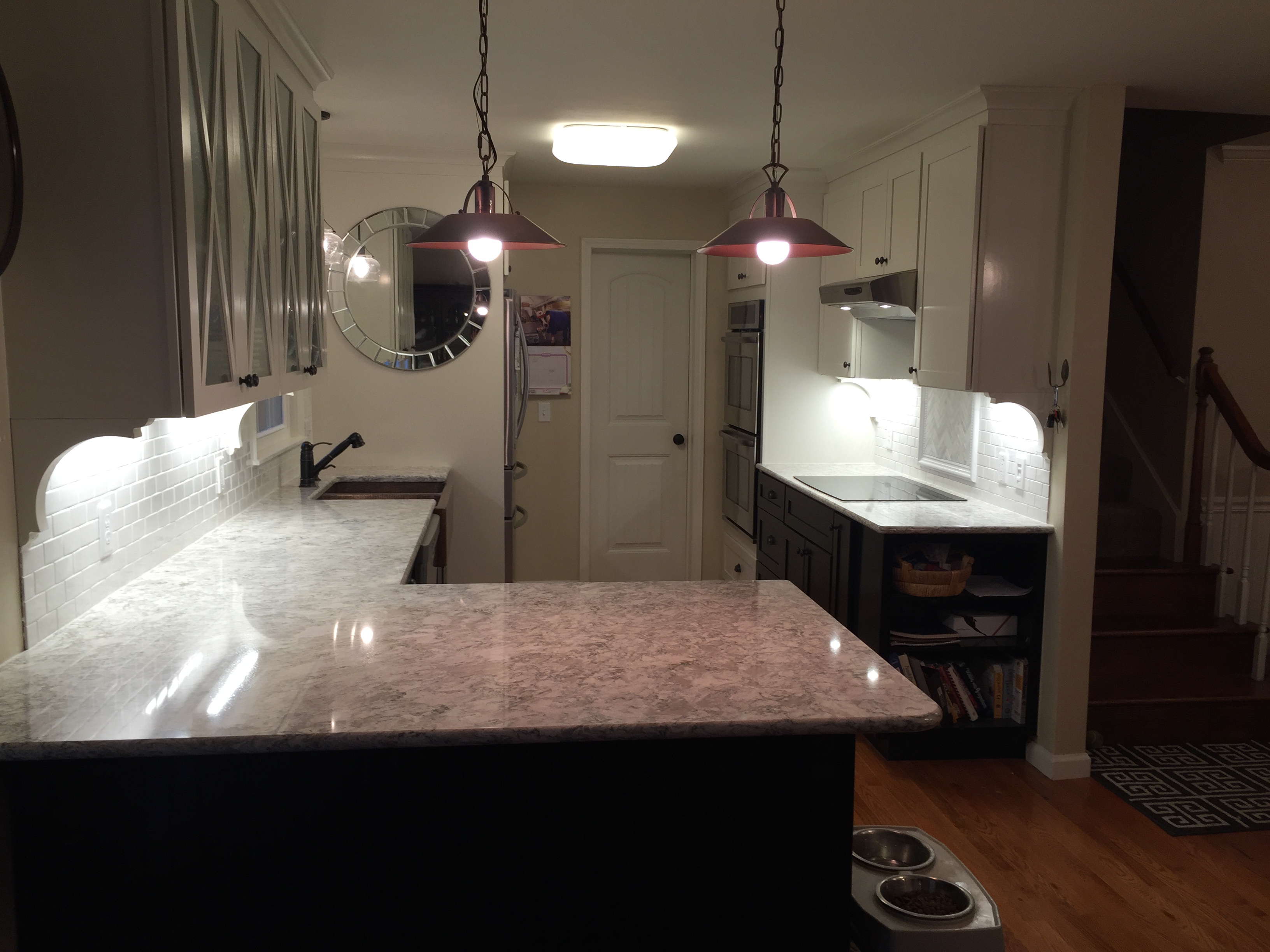
 This was the other end of the kitchen.
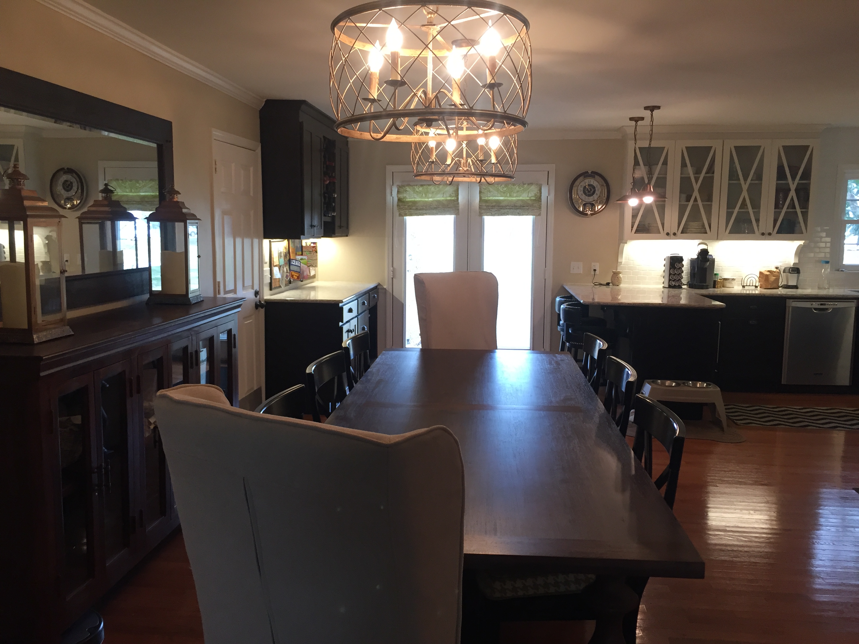
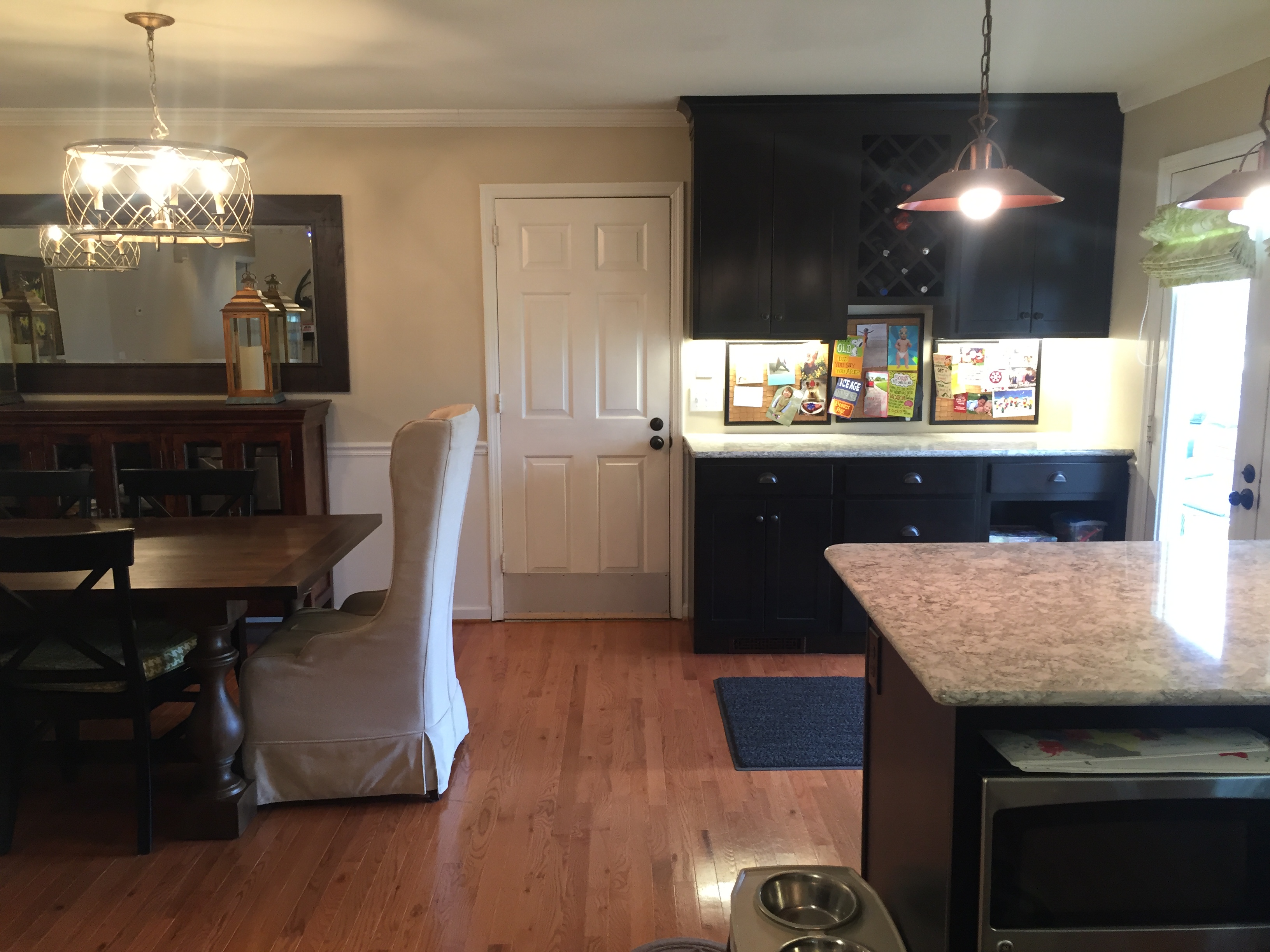 We took out the wall separating the room from the dining room and it really enlarged the look of the kitchen. The built in cabinetry on the wall provides ample storage and a landing pad for things we carry in from outside when we enter the home through the back door. I used cork boards as the backsplash and I use them to display greeting cards and photos on a seasonal basis. I even have dedicated wine storage with the built in wine rack.
 This was the former dining room leading into the kitchen. After the wall was removed and a header beam installed, it now looks like this:
 The wall is gone!
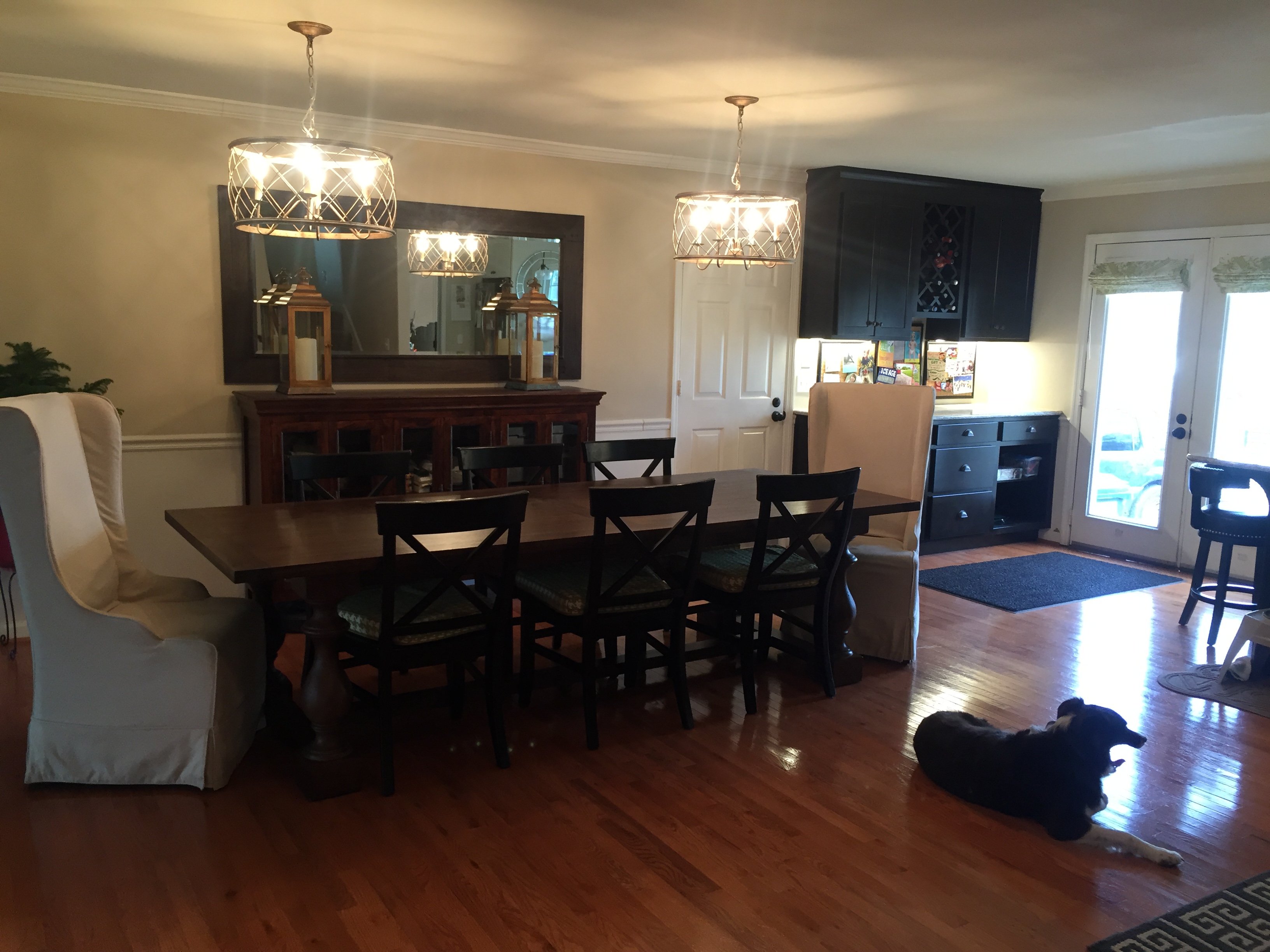
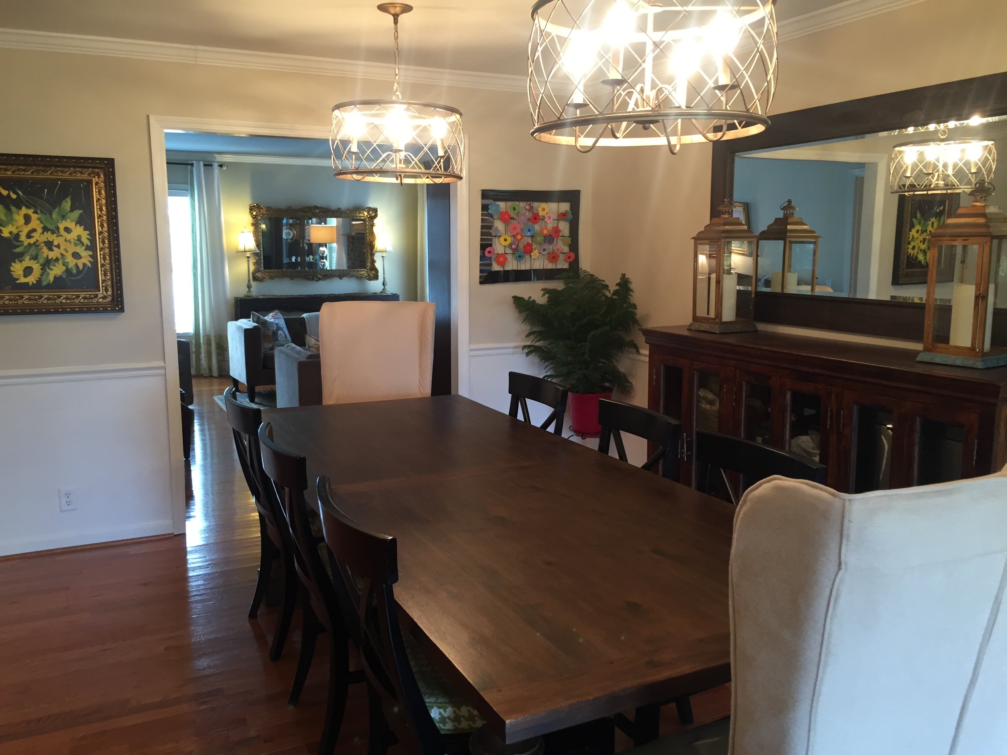 I chose a really long Restoration Hardware table because it’s the heart of our home. We eat here, host dinners here, do homework here and play games. I originally got the exact same table, just one size smaller and once it got here I regretted it and wished I had gotten the bigger one. I decided to call and ask if it would be possible to return the one I had and go one size bigger, and the customer service couldn’t have been more outstanding. The rep I talked to was polite, friendly, knowledgable and assured me it would be no hassle. In fact, the table had gone on sale since I bought it and not only did they come take the old one away and bring the new one, they actually credited me back $60! To get a bigger table! Bang up experience in my book.
I chose double chandeliers over the dining table to make a more dramatic statement and to add more lighting. I had the electrician install a dimmer switch so now I can have mood lighting whenever I choose.
The dining chairs repeat the same “X” pattern from the cabinet glass, and I had a seamstress make custom cushions in a houndstooth green color that is part of my color palette for the living room. With the dining room being open to the living room, I wanted a cohesive look. I repeated the same green on the roman shades on the back door, and I am feeling pretty unified. The tall wing back chairs at either end of the table I chose for the dramatic statement, and they are actually *really* comfy! The bonus is that they are slip covered, so knowing that my kids, dog, husband, and I can be hard on things, they can just be removed and washed on an as needed basis. Luckily I haven’t had to do that yet!
I debated over having a mirror wall installed over the dining room credenza. I was going to have it go from the chair rail to the crown molding and from wall to wall to reflect more light and visually expand the space. I still may do it someday, but for now, the giant mirror hanging over the credenza is what I settled upon. My husband thought the mirror wall would be too 1980’s; I’d love to get feedback on whether anyone agrees or disagrees with him! You can feel free to comment at the end of this post.

 This was the living room before. Not bad, and one of the rooms in the house that was in the best shape. We repainted it anyway, and changed the flooring, and that was really it for changes other than furniture.
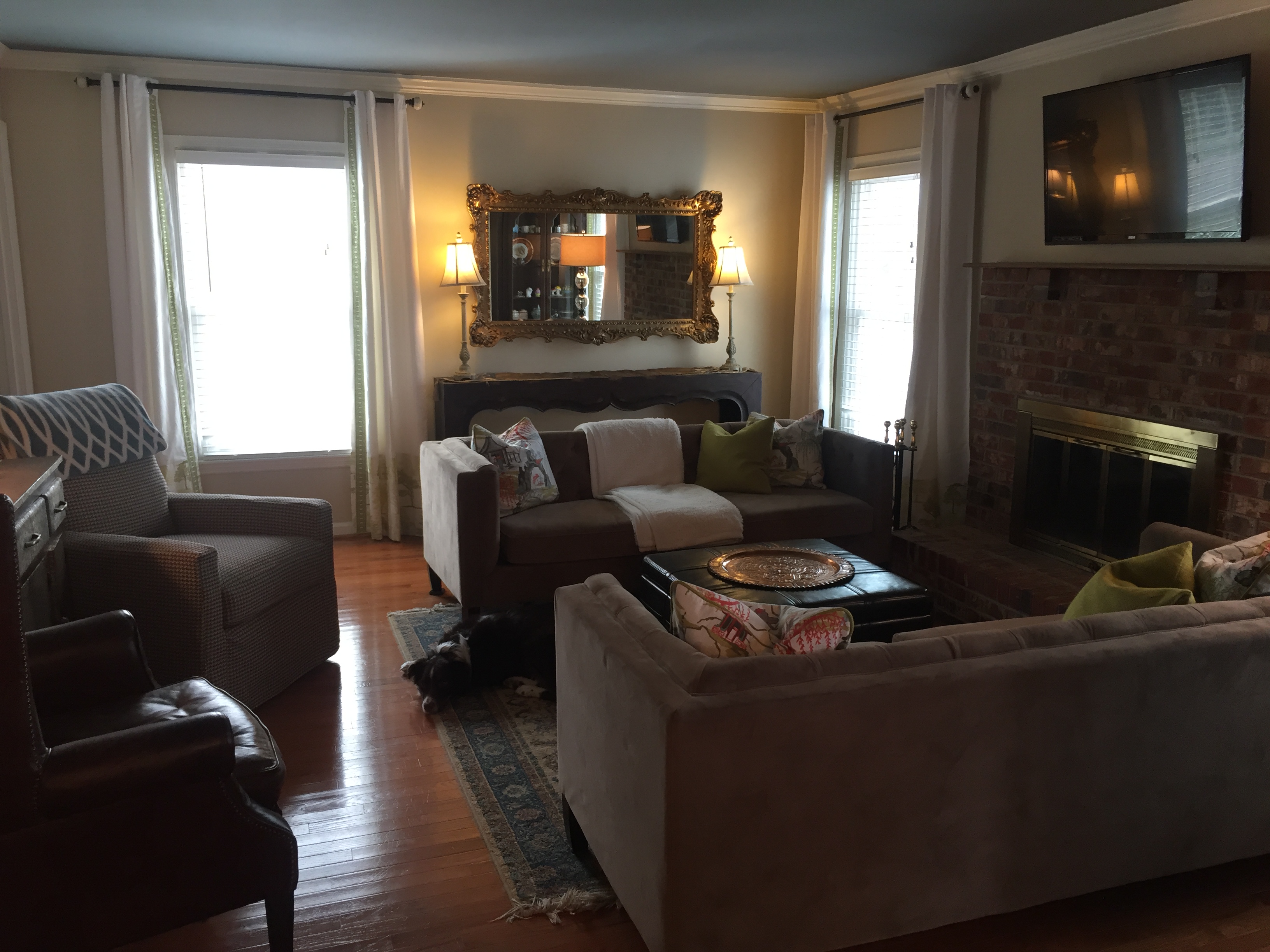
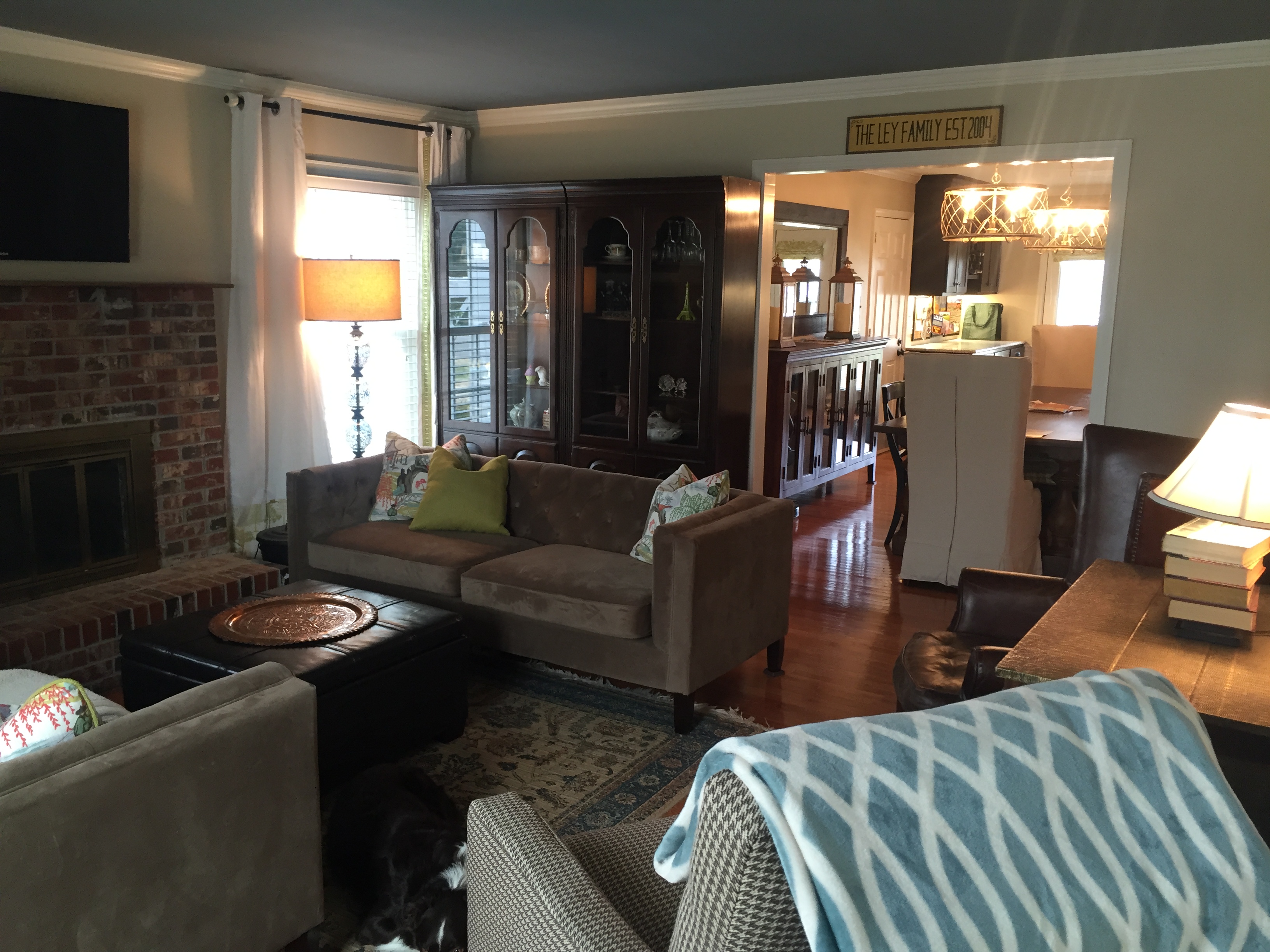
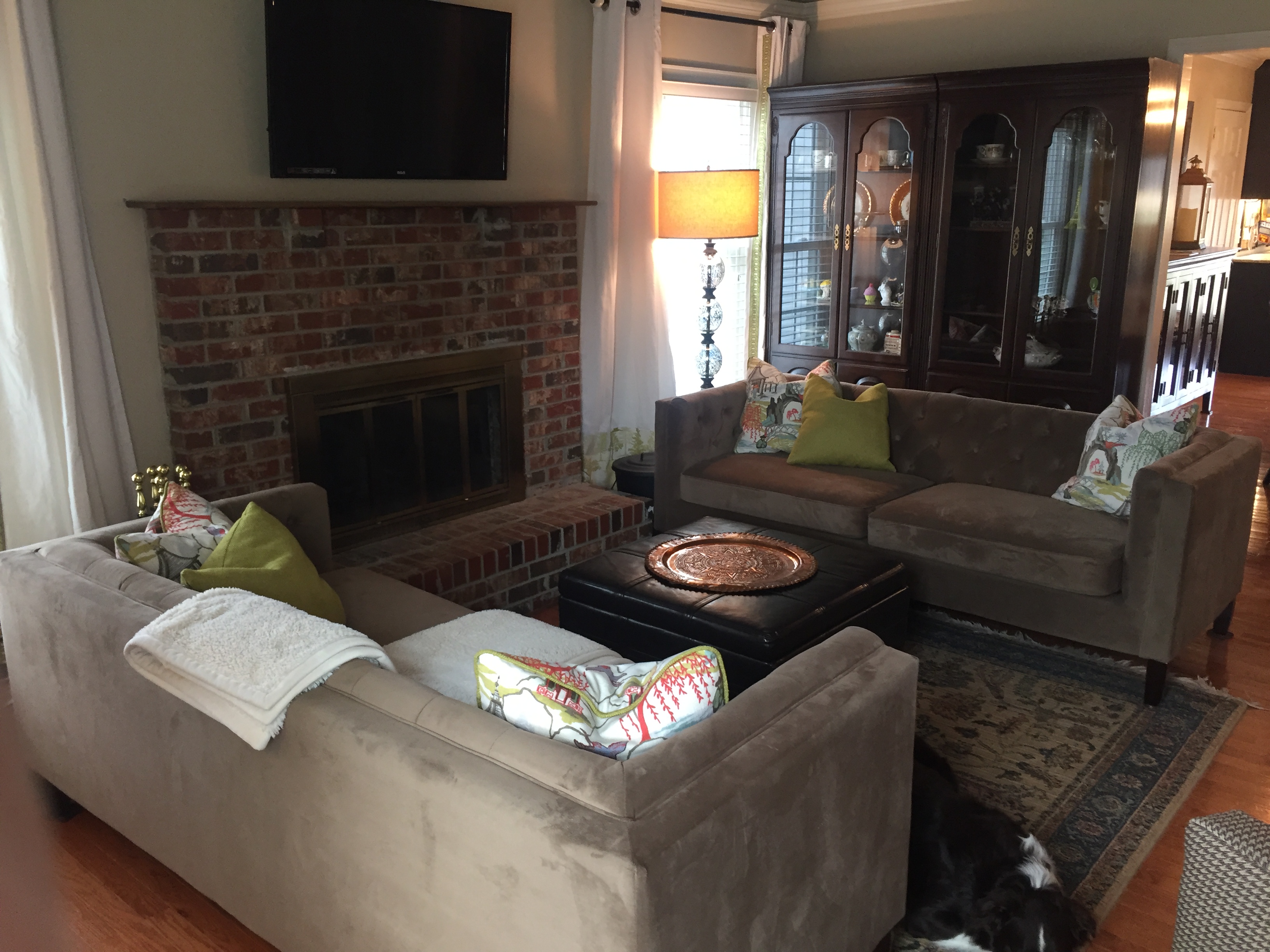
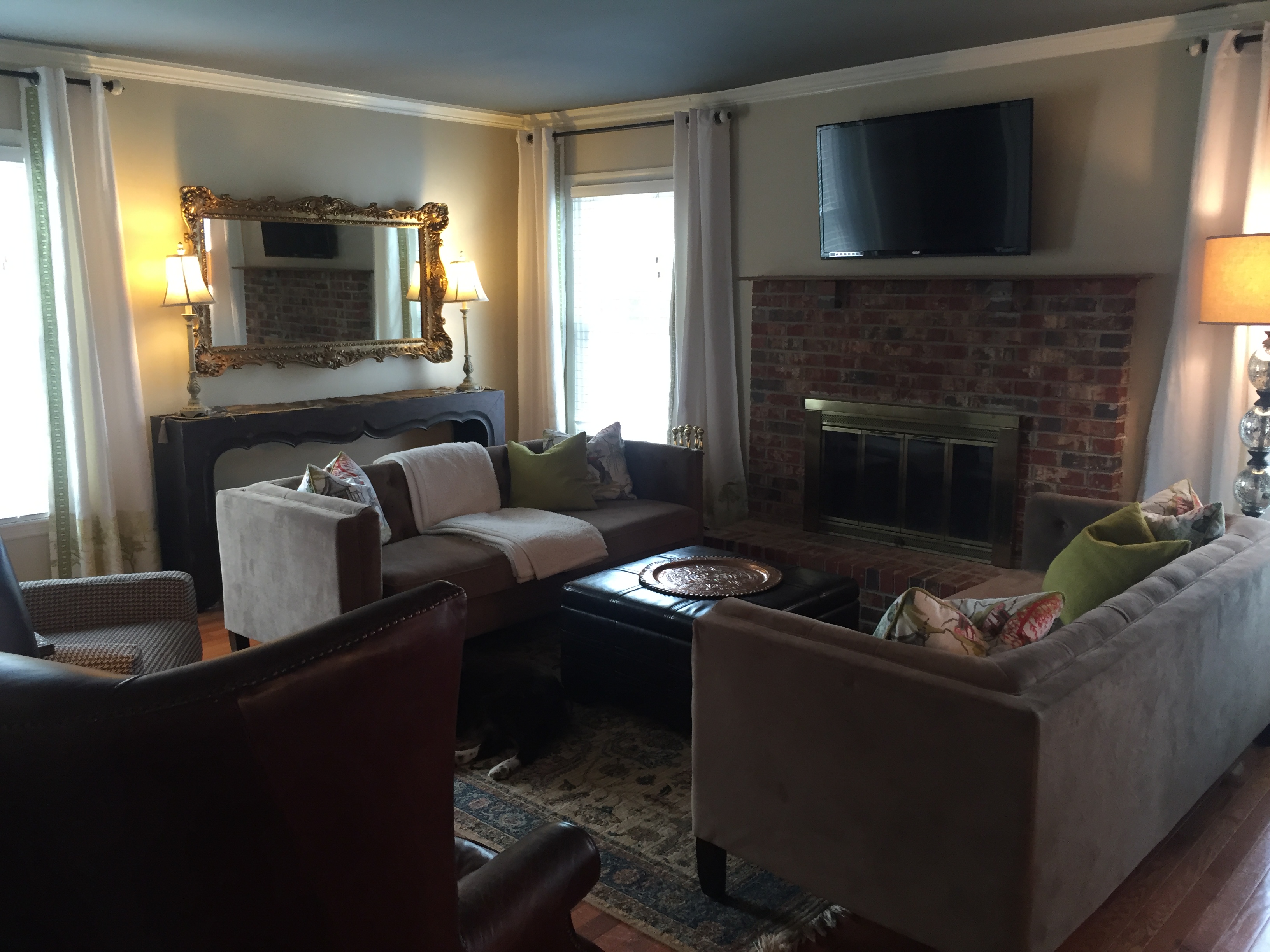 This is where I can really see the Indiana Jones/ Hobbit inspiration. I opted to paint the ceiling to make the room feel cozier and more special and I kept the wall color the same throughout the downstairs to make everything flow together better. The green pillows on the sofas and edging of the curtains tie in with the green in the dining room and kitchen. The dark rich leather of the storage ottoman and wing back chair contrast with the gilded mirror frame, copper tray and lamps. We had the tv mounted above the fireplace to keep the focal points together, and eventually we are going to add a standout mantle to the space, but hubby wants to build one himself, so it may take awhile. I lucked out that my china cabinets, which were a gift from my aunt who didn’t use them anymore, fit perfectly on the wall leading into the dining room. It almost mimics the look of a built in on that wall. The chesterfield style of the sofas adds to the Art Deco style (and they are currently on trend, bonus!). I wanted to fit as many seating options as I could into the space, for times when we have company. The sofas can sit 3 each, in a pinch, the two chairs can fit 2 more, and I had an adorable little stool reupholstered in a cow hide print that I can pull out to seat one more if necessary, so I can seat 9 people all together. All in all, it feels like a cozy, home-y little living room to me, and over time I can enjoy finding exotic decor items to add to the space. I can envision a chilly fall or winter evening with a cozy fire, a glass of wine, company over, and a good philosophical discussion going. It’s my happy place.
Lastly for now, the hall bath.  This was the hall bath before. Okay, but nothing spectacular. It is a full bath, and it’s the bath that guests and visitors use. I knew I liked the vanity cabinet, but the countertop, mirror, lighting, and wall color needed to be changed.


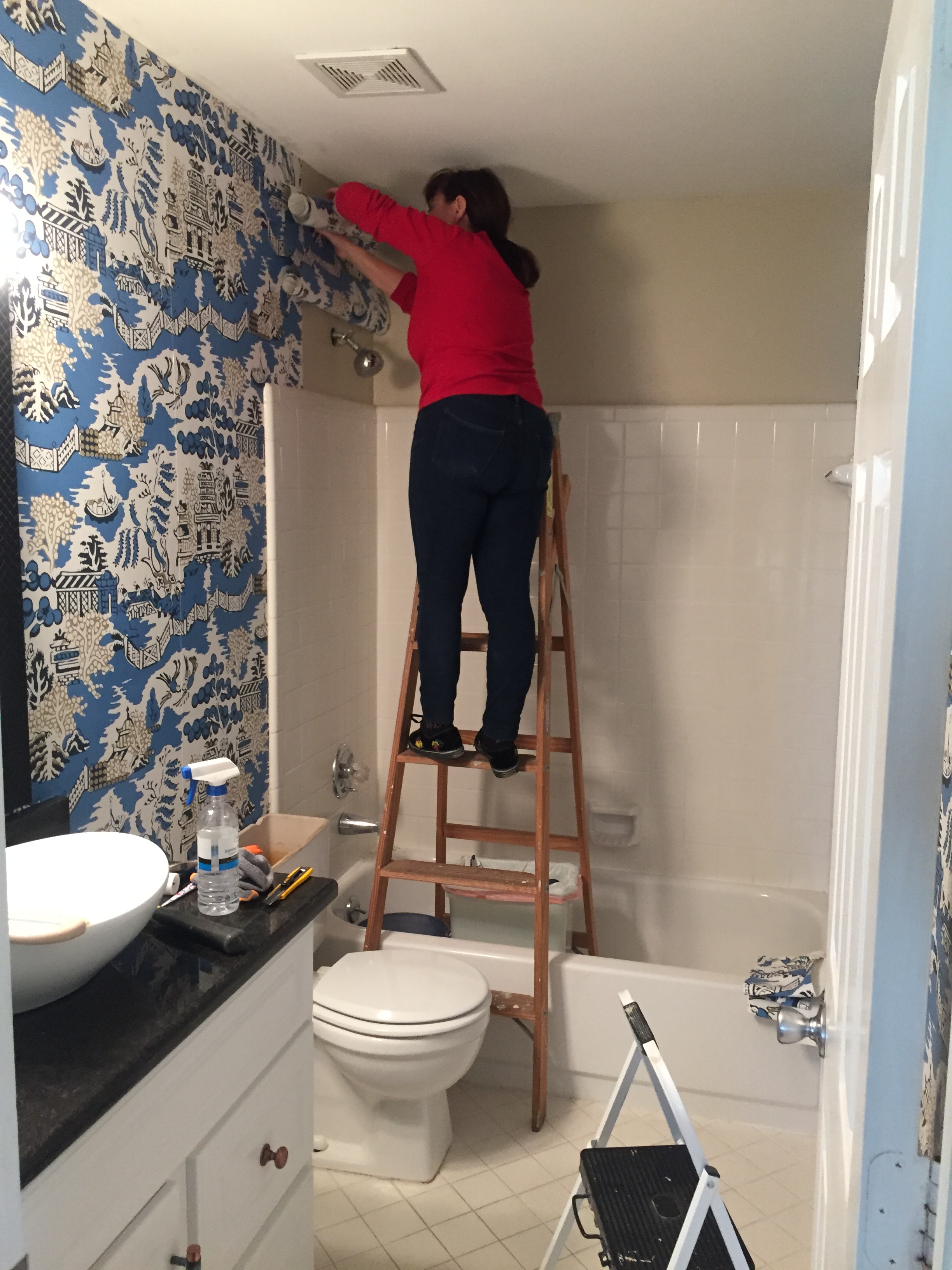 (In progress- that’s my cute mom!)
They say a tiny bathroom can be like a jewel box. Wall paper is back in a big way, and this wall paper just spoke to me. It’s a chinese imperial toile scene, and I just love the bold graphic quality to it. It adds TONS of personality into this previously blah space. The new black pearl granite top, the vessel sink and faucet, and the bronze light fixture round out the space into the room that I am quite possibly the most proud of. I just love dashing in there every time I go for a quick visit. The magic literally hasn’t worn off yet for me, and that I think, is the indicator of great design.
Still to come in a future post: The master bedroom/bathroom/closet! The office! The upstairs bonus room, kids bedrooms, bathroom!

I love the new living room furniture. I think I would miss the rocking chair, though.
The mirror idea in the dining room may date your home, depending on how long you live in it before you resell it. Attaching mirror to the walls can be difficult to remodel. I really like the hutch and mirror you have now and it could be removed easily when the time comes. It’s very attractive.
Here’s a little hint that might help you with your copper, kitchen sink. Try using a spray bottle and put about a fourth of a cup of vinegar and fill it with water. When you feel your sink is getting discolored, shake the bottle and spray the copper. Rinse it with clear water and wipe it down with a clean cloth. You don’t have to do this often. I love my copper pots; and when they get really ugly, I use a little bit of Babo and vinegar to scrub them really well.
Love the new project!